Brand
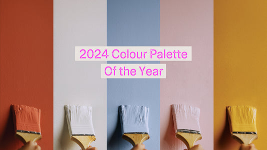
2024 Colour Palette of the Year

Introduction.
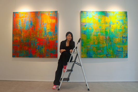
In 2023, we all returned to regular programming with a greater semblance of normalcy. Through it all, Kindred was the backdrop of this renewal and rejuvenation – a grounding greige colour you can rely on. As we slowly switch gears into 2024, we’re hoping for a little more of everything that we love and cherish. More colour, more experiences, more balance. An assortment of tapas – tasting plates of everything on the menu. With that in mind, we’ve carefully curated not just one colour, but a well-balanced colour palette that captures the essence of everything good in life.
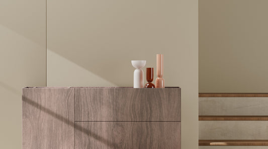
Our 2024 Colour Palette of the Year.

A mix of bold and soft shades, these colours came together and threw the hottest party of the year. Each one bringing their own personality and energy into the mix – taking you from entertaining guests in a vibrant space, to sweet tranquility in the bedroom, and everywhere in between.
Blooming.

A cool baby blue. Peace, tranquility and stability; have it all. Gentle enough to complement various furnishings while retaining its personality.
Terra.

Exposed terracotta brick on the streets of London; signalling decades of history rebuilding to be anew again. Brownish-red. A mix of Earth and Fire. Goes exceptionally well with cream and beige to create a natural vibe.
Mamma Mia.

A baby pink so delectable, it should be illegal. Fun, feisty but never fierce. Pair with other bright colours like yellow or turquoise for a cheerful, beachy vibe. Or use neutrals to draw focus to the pink.
Dairy Alternative.

Creamy white with a subtle tinge of yellow. The off-white of all off-whites. Feel the world in the palm of your hands, it’s welcoming you warmly.
Mango.

Rock out your sundress, it’s a party. Fruity, luscious and light. There’s room for everyone here. Go big — paint with a deep purple to create a colour blocking graphic look. Or stay at home — include neutrals like white, cream or beige for more light and air.