Wellness
Colours are awesome. Nature has gifted us earthy hues from greens to blues, and more vibrant colours like red, yellow and pink. It’s undeniable how colours have a remarkable influence on our mood. We’ve all been there – donning that stunning vermillion dress for date night just to set the vibe right. Colours just have a way of evoking emotion – from feelings of joy and warmth to promoting productivity and contemplation. This extends to the colour on our walls too. Depending on the function of the room, choosing the right colour can do wonders.
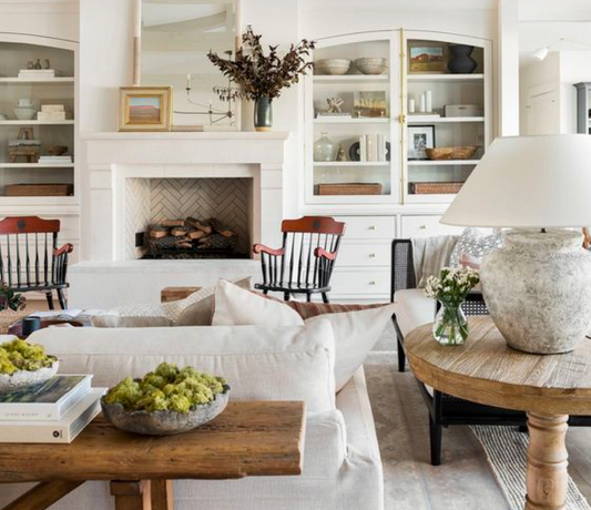
Joy and warmth.

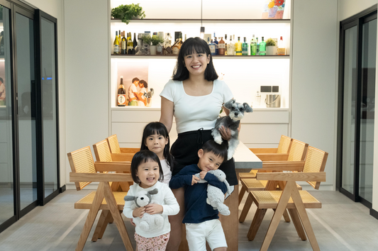
If your home is your happy place, let it reflect on your walls with warmer tones. After all, joy is contagious. Incorporate these colours into living rooms, kitchens or social areas – this can foster a lively and welcoming environment encouraging laughter and cheer.
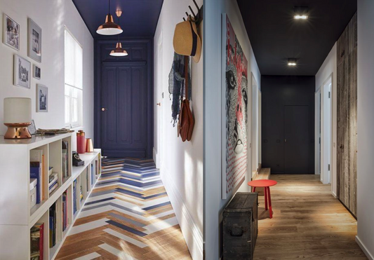
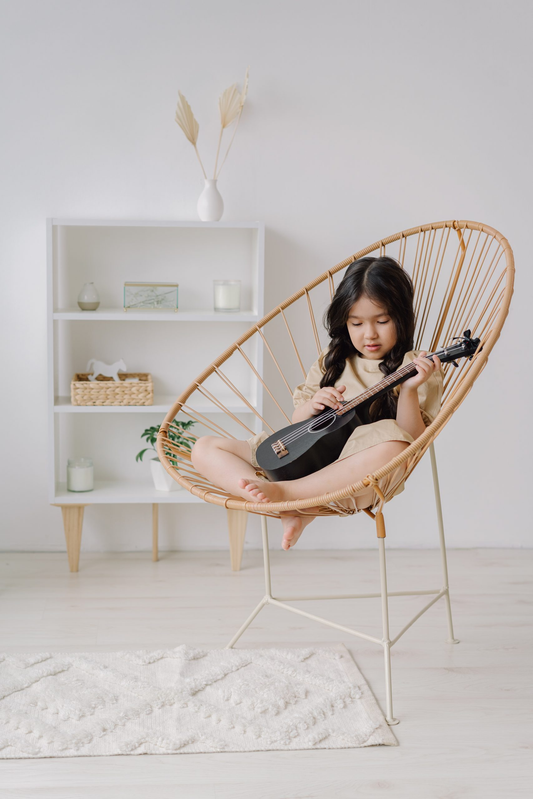
Playful and creative.

Creativity can be limiting when you’re confined within 4 walls. Add a splash of colour with some of our unique blends. Your brain will enjoy the tickle. These vibrant hues stimulate the imagination, inspiring innovative thinking and artistic expression. Use these colours in playrooms, art studios or creative spaces.
Bold and energetic.
If you’re unafraid to venture into the bold, these colours are sure to invite an added dimension to your space. Pigmented, deep and full of life; there’s never a dull day. These hues exude confidence and vitality – ideal for spaces that require a strong and energetic presence. Use them in fitness areas, workspaces or areas where motivation is much-needed.
Romantic and sweet.

Your home can be ethereal too. By selecting lighter tones and matching them perfectly, it’s simply magical. These hues create an environment that exudes love and tenderness – perfect for bedrooms, intimate dining areas or spaces dedicated to relaxation.
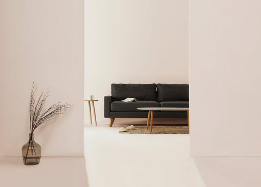
Grounding and safe.

Come home to safe, solid ground amidst the chaos. Choose darker colours found in nature to ground yourself. It’s all going to be okay. These hues create a sense of stability and security, making them suitable for bedrooms, meditations areas or reading nooks. You’ll feel deeply relaxed and introspective – just the way you like it.
Fresh and healing.

By using light colours in cooler tones, you invite lightness into your home. It feels fresh, invigorating and healing, but never sterile. These colours are associated with nature and renewal, ideal for bathrooms, spa-like spaces or areas where relaxation and revitalisation are paramount.
Productive and contemplative.

For rooms made for thinking and working, darker colours have a way of centering your balance while keeping you on task. Forget about those distractions – these colours promote focus, concentration and introspection. They’re great for home offices, libraries or study areas. Now, go forth and get productive.
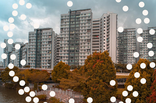
Colours for every space.
Before you pick your colours, think deeply about the function of each room. What’s the mood you’d like to set? Matching colours with lighting and furniture are also other important considerations to take into account. We highly recommend purchasing sample sheets/paint packs to test on your walls first before pulling the trigger. Most importantly, don’t forget to have fun.
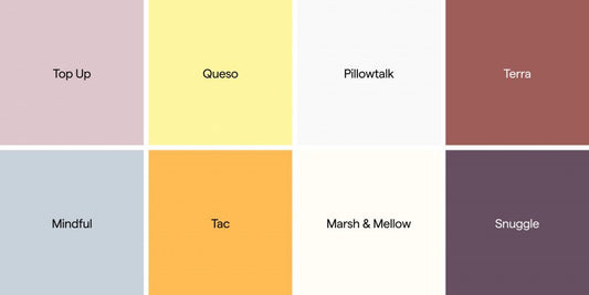
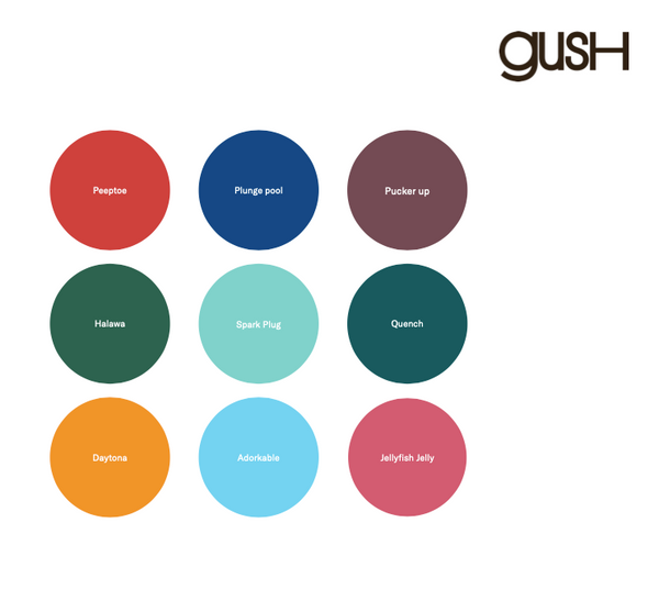
Important note: Not all Gush colours featured are available online. To gain access to our full collection of colours, engage our preferred painting service partner, Groundworks.
More resources:
Which Gush paint should I get?
How do I match paint colours with house lighting?
Gush’s guide to colour theory
15 design styles in every colour
8 painting hacks to maximise space in your home
Shop Gush paints now